CHALLENGE
Tapping into the brand's beer-lover spirit
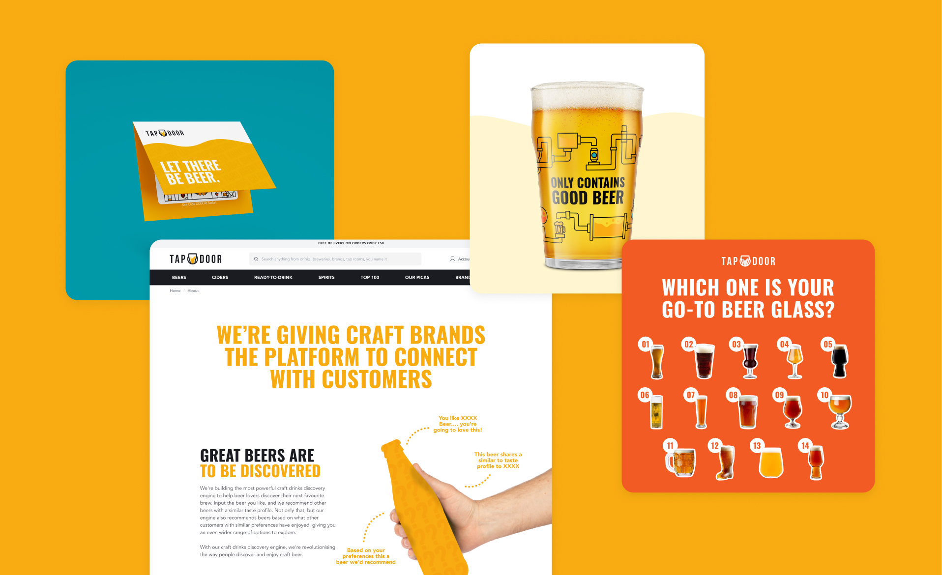
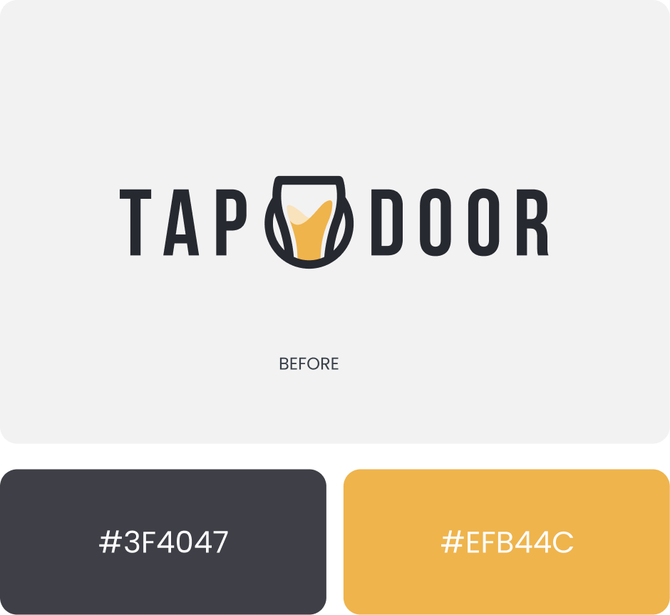
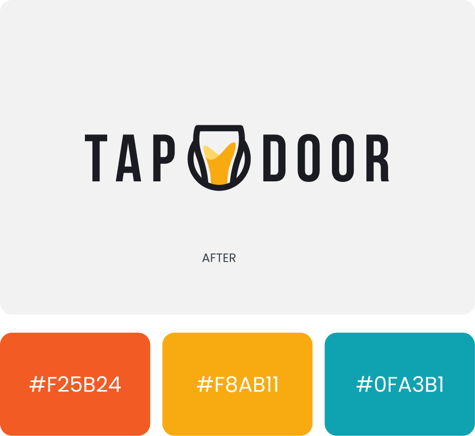
The challenge of this rebrand was enhancing an already well-established brand. With its original illustration-style graphics, the goal was to shift the creative direction while preserving Tap Door's core identity, ensuring it remained strong and recognizable. To achieve this, we introduced actual beer photos, integrating them with flat graphics and wavy patterns. This approach re-emphasized the beer glass in the logo, creating a stronger visual connection to the brand’s core focus.
WEBSITE
Revamping the digital experience
The biggest revamp needed for Tap Door was its e-commerce website. While the UX was functional, the visuals were outdated. The goal was to refresh the design and better showcase the brand's products, creating a more engaging and visually appealing online experience.
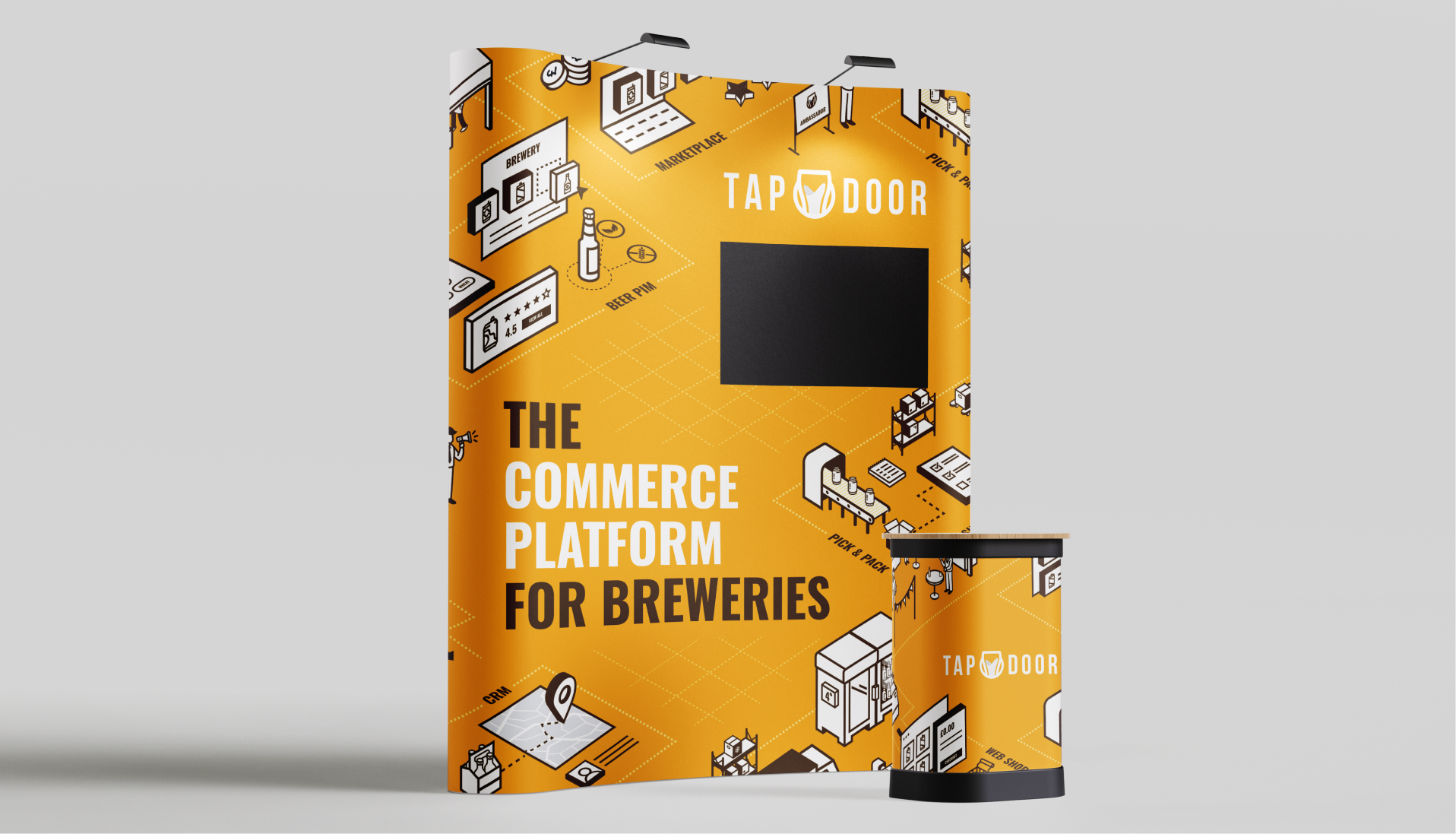
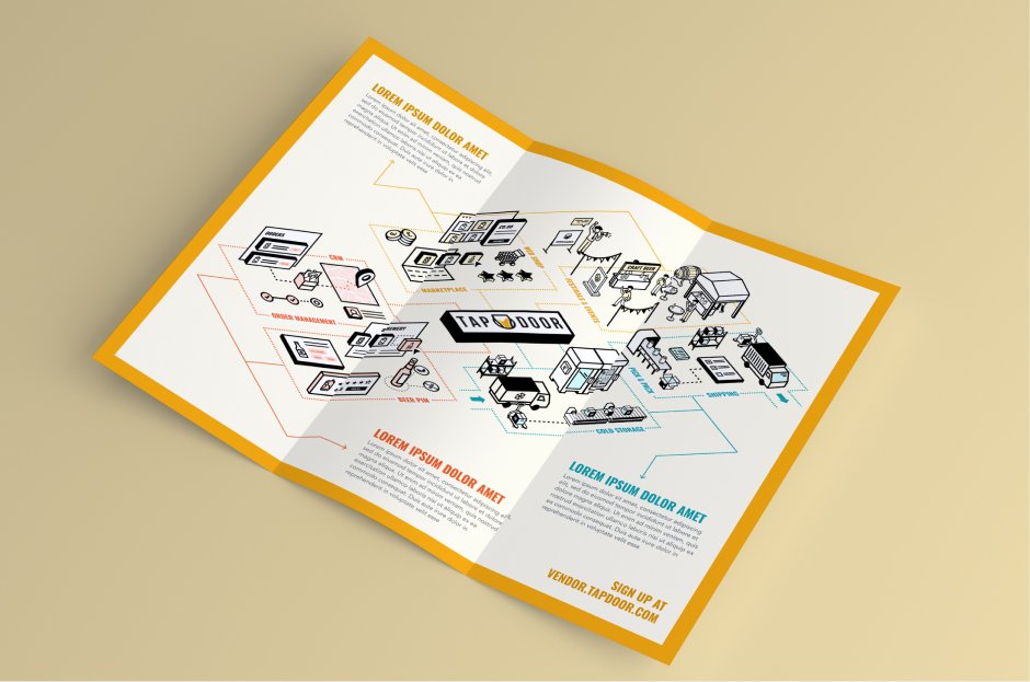
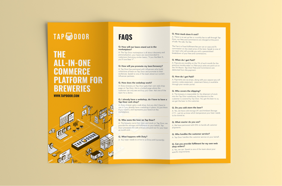
EVENT PARTICIPATION
Crafting impact at BeerX
One of the major events that Tap Door participates in is BeerX, a premier beer festival celebrating craft beer, brewing innovation, and the beer-loving community. For this event, the goal was to create an eye-catching stand and engaging leaflets to distribute. The standout graphic for Tap Door was an isometric-style design that showcased the entire process, effectively capturing attention and communicating the brand’s story.
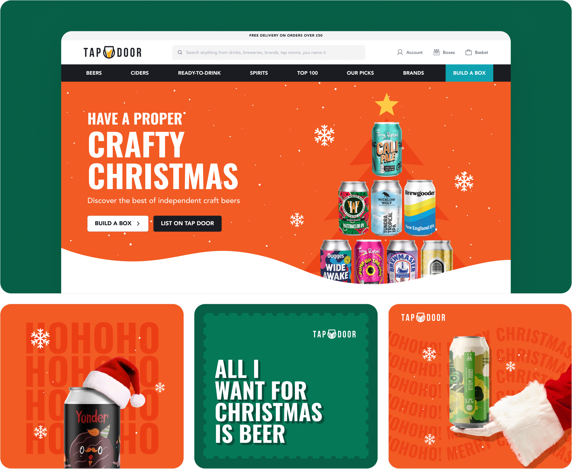
HOLIDAY SEASON
Spreading Holiday Cheer with Tap Door
Christmas, one of the most celebrated holidays, was the focus of this campaign. We introduced Santa Claus and designed beers to resemble a Christmas tree. With combined efforts from sales and marketing, the festive campaign became a memorable success.
Impact
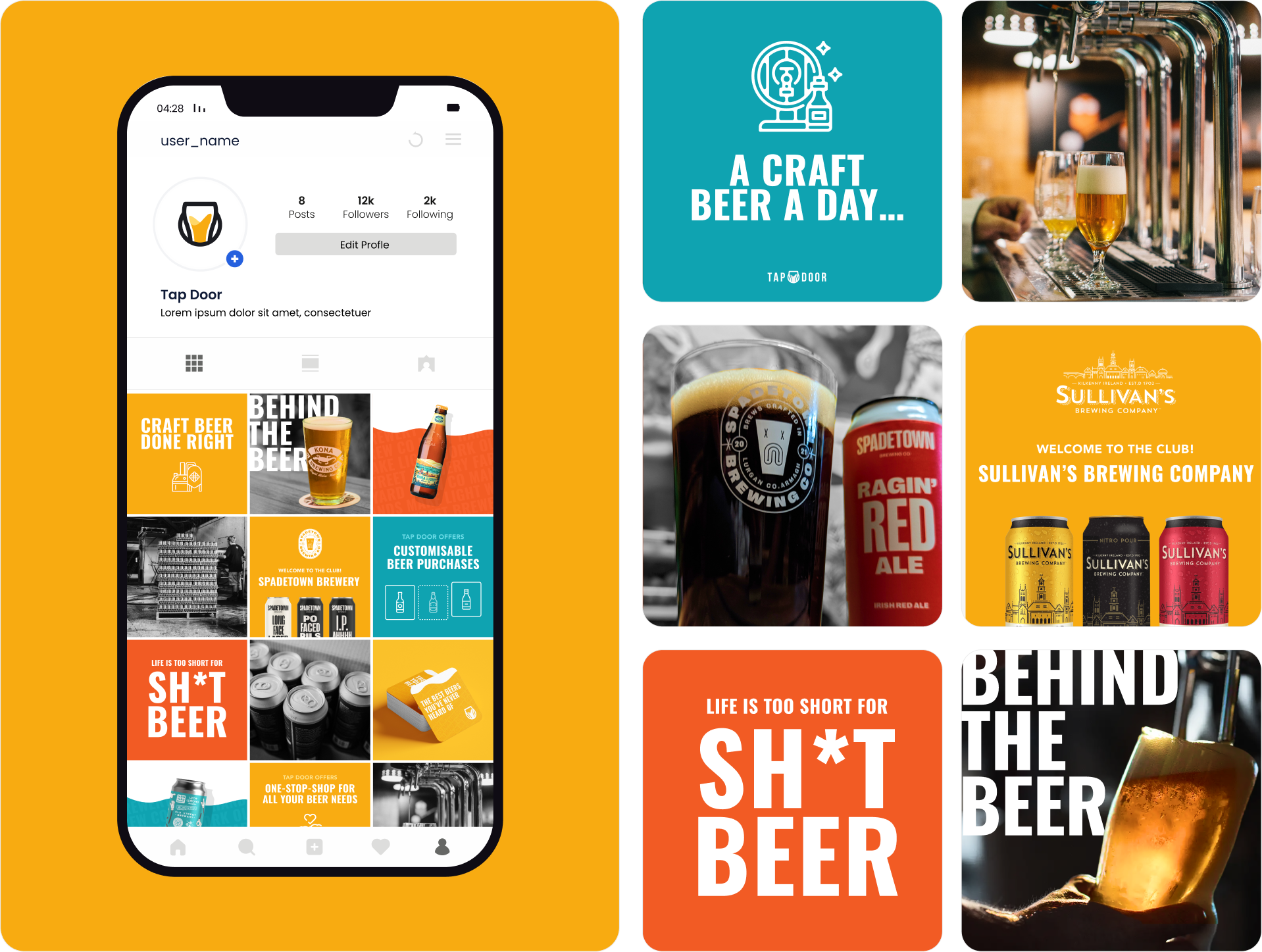
The rebrand revitalized Tap Door’s identity, seamlessly blending its beer-loving culture with modern visuals and bold storytelling. From refreshed social media to a revamped e-commerce site, every element strengthened the brand’s connection with its audience, making it more approachable, engaging, and memorable.